Customer Support Dashboards for Support Managers: Templates & KPIs

Support managers often need six dashboard views: a live operational wallboard, a manager queue view, User scorecards, a CSAT trend dashboard, an SLA health monitor, and an executive risk view. A practical implementation uses two layers: an operational view for Users and team leads, plus role-specific drill-downs for managers and executives.
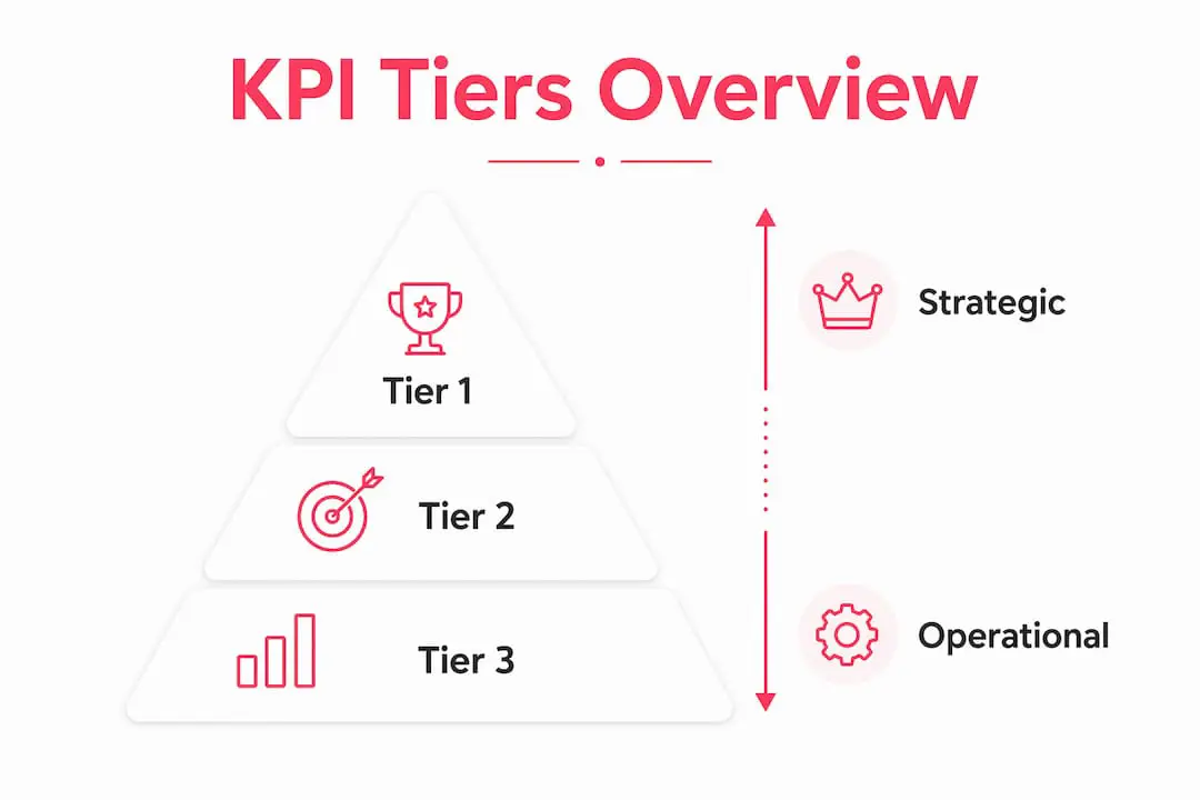
Tier 1 KPIs to consider: First Response Time (FRT), First Contact Resolution (FCR), Customer Satisfaction Score (CSAT), Average Handle Time (AHT), and SLA compliance rate.
Tier 2 (operational health): Backlog size, escalation rate, tickets per User.

Tier 3 (business impact): Cost per resolution, support-influenced revenue, churn-risk signals from ticket patterns.

A sensible path to production is to connect your helpdesk, create role-specific views, set thresholds, and publish each view where its audience will actually use it.
The six templates covered below:
- Live operational wallboard
- Manager queue and workload view
- User scorecards
- CSAT and quality dashboard
- SLA and aged ticket monitor
- Strategic and product-facing dashboard
Pro Tip: Don’t build all six at once. Start with the wallboard and one manager view. Get those right before adding the rest.
Table of Contents
- What types of support dashboards exist, and when should you use each?
- Which KPIs belong on your support dashboards?
- Six ready-to-use dashboard templates for support teams
- How to set targets, thresholds, and alerts that actually change behavior
- Design and data best practices for accurate dashboards
- How long does it take to implement support dashboards?
- How Deskhero supports operational and reporting views
- Common pitfalls in dashboard design that lead to wrong conclusions
- Key Takeaways
- What I’d build first as a support manager
- Start with Deskhero’s built-in reporting
- Useful sources
- FAQ
What types of support dashboards exist, and when should you use each?
Real-time shared wallboards make operational metrics visible to the whole team. But not every dashboard should refresh every second, and not every audience needs the same view.
The four main types break down by decision speed and audience:
- Operational wallboard: Live queue depth, active tickets, Users online, SLA countdown timers. Built for Users and team leads who need to react in minutes. Refresh: real-time.
- Manager queue and workforce view: Open tickets by age and priority, User availability, SLA at-risk percentage, backlog heatmaps. Refresh: real-time to hourly.
- User personal scorecard: Daily tickets closed, personal CSAT, AHT, leaderboard position. Refresh: real-time or end-of-shift snapshot.
- Executive risk dashboard: SLA trend, CSAT trend, escalation rate, churn-risk flags, cost per resolution. Refresh: daily to weekly.
Two additional types serve specific functions. A CSAT and quality dashboard tracks survey response rates, trendlines, and verbatim sampling. An SLA and aged ticket dashboard forecasts breaches before they happen.
| Dashboard Type | Primary Audience | Decision Supported | Refresh Cadence |
|---|---|---|---|
| Live operational wallboard | Users, team leads | React to queue spikes now | Real-time |
| Manager queue view | Support managers | Rebalance workload, flag SLA risk | Real-time to hourly |
| User scorecard | Individual Users | Self-correct behavior, track goals | Real-time or shift-end |
| CSAT and quality | QA, managers | Identify coaching targets | Daily |
| SLA and aged tickets | Managers, ops | Prevent breaches, escalate early | Real-time to hourly |
| Executive risk view | Directors, VPs | Spot business-level risk | Daily to weekly |
Use-case mapping matters here. A call center may keep the wallboard and SLA monitor on a TV all day. A SaaS helpdesk may focus on CSAT trends and recurring issues. An e-commerce team during peak season may spend more time in the manager queue view. Remote and hybrid teams can publish an operational view in a shared channel if their reporting stack supports it.
Choose a refresh cadence that matches the decision. Operational views may need live or hourly data, while trend and executive views can refresh daily or weekly. This customer support metrics reference provides additional definitions and context.
Pro Tip: Surface dashboards where people already work. A dashboard nobody opens is just a report.
Which KPIs belong on your support dashboards?
A tiered metrics framework can separate tactical signals that Users act on daily from measures that connect support to broader business outcomes. Here’s one way to structure them.
| KPI | Formula / Definition | Tier | Who Sees It |
|---|---|---|---|
| First Response Time (FRT) | Time from ticket creation to first User reply | 1 | Users, managers, execs |
| First Contact Resolution (FCR) | Tickets resolved on first contact ÷ total tickets | 1 | Managers, execs |
| CSAT | Sum of positive ratings ÷ total survey responses | 1 | All roles |
| Average Handle Time (AHT) | Total handle time ÷ tickets handled | 1 | Users, managers |
| SLA compliance rate | Tickets resolved within SLA ÷ total tickets | 1 | Managers, execs |
| Backlog / aged tickets | Open tickets older than X days | 2 | Managers |
| Escalation rate | Escalated tickets ÷ total tickets | 2 | Managers |
| Tickets per User | Total tickets ÷ active Users | 2 | Managers |
| Cost per resolution | Total support cost ÷ resolved tickets | 3 | Execs |
| Support-influenced revenue | Revenue from accounts with resolved tickets in period | 3 | Execs, CS leaders |
| Churn-risk signal | Accounts with high ticket volume + low CSAT + no resolution | 3 | CS leaders, execs |
Core customer service metrics like CSAT, Customer Effort Score (CES), and Net Promoter Score (NPS) are widely tracked, but they serve different purposes. CSAT measures satisfaction with a specific interaction. CES measures how easy the interaction was. NPS measures overall loyalty. For most support dashboards, CSAT and CES belong on the operational layer; NPS is better suited to the executive view.
A few notes on benchmarks: industry averages for CSAT vary significantly by sector and ticket type. Rather than chasing a universal number, set your baseline in the first 30 days and measure improvement from there. FCR benchmarks similarly depend on your product complexity and channel mix.
Joining ticket data with CRM and billing data is what moves support from operational reporting to business impact. When you can see that a high-ticket-volume account with declining CSAT is also up for renewal next month, that’s a Tier 3 signal worth escalating.
Users may need a focused subset of Tier 1 metrics. Managers usually need Tier 1 and Tier 2. Executives generally need trends and business-impact signals rather than raw ticket counts.
Six ready-to-use dashboard templates for support teams
These blueprints are designed to be copied directly into your helpdesk or BI tool. Each one maps to a specific audience, decision, and data source.
| Template | Primary Audience | Must-Have Metrics | Typical Visuals | Refresh | Expected Action |
|---|---|---|---|---|---|
| Live operational wallboard | Users, team leads | Queue depth, FRT, SLA countdown, Users online | Gauges, queue bars, alert banners | Real-time | React to spikes, reassign tickets |
| Manager queue view | Support managers | Open tickets by age/priority, SLA at-risk %, User availability | Heatmaps, stacked bars | Real-time to hourly | Rebalance workload, escalate |
| User scorecards | Individual Users | Daily tickets closed, CSAT, AHT, leaderboard rank | Progress bars, micro-trends | Real-time or shift-end | Self-correct, hit daily targets |
| CSAT and quality | QA, managers | CSAT trend, survey response rate, verbatim samples, quality score | Trendlines, distribution charts | Daily | Identify coaching targets |
| SLA and aged tickets | Managers, ops | SLA breach forecast, age distribution, escalation rate | Stacked bars, threshold markers | Real-time to hourly | Prevent breaches, escalate early |
| Strategic / product-facing | Directors, CS leaders | Issue clusters, churn-risk flags, support-influenced revenue | Trendlines, cohort tables | Daily to weekly | Prioritize product fixes, flag renewal risk |
Template 1: Live operational wallboard. The wallboard is the heartbeat of your support floor. Show queue depth by channel, FRT for the last 60 minutes, a countdown for tickets approaching SLA breach, and a live count of Users online. Use large gauges for queue depth and color-coded alert banners when thresholds are crossed. Office TV wallboards can be set up quickly and give the whole team shared situational awareness without anyone needing to open a report.
Template 2: Manager queue and workload view. This is the dashboard you check before a standup. Open tickets sorted by age and priority, User availability (available vs. busy vs. offline), SLA at-risk percentage, and a heatmap showing backlog concentration by segment or product area. Hourly refresh is fine for most of this, but SLA at-risk should update in real-time.
Template 3: User scorecards. Each User sees their own numbers: tickets closed today vs. their daily target, personal CSAT score, AHT, and their rank on the team leaderboard. Progress bars work well here. A micro-trend line showing CSAT over the last 7 days gives Users context without overwhelming them. Refresh at shift end for a clean daily snapshot, or real-time if your team is competitive about leaderboard position.
Template 4: CSAT and quality dashboard. CSAT dashboards can combine survey response rates, trendlines, and selected comments. Show the CSAT trend over 30 and 90 days, the survey response rate, a sample of recent comments, and a quality score breakdown by User or team. Add segment filters for channel, product area, or customer tier.
Template 5: SLA and aged ticket monitor. The goal here is to catch breaches before they happen. Show a breach forecast (tickets likely to breach in the next 2 hours), an age distribution chart for open tickets, and escalation rate over time. Use threshold markers on bar charts so the risk level is visually obvious. Real-time SLA monitoring with drill-downs for root-cause analysis is a standard feature of mature contact center dashboards.
Template 6: Strategic and product-facing dashboard. This view connects support to the business. Show recurring ticket topics and, where your data supports them, account risk indicators, support-influenced revenue, and funnel impact. Combining retention-focused signals with account data can help CS leaders investigate risk before a renewal conversation.
How to set targets, thresholds, and alerts that actually change behavior
A dashboard without thresholds is just a scoreboard. Thresholds turn metrics into triggers.
The target-setting framework:
- Establish your baseline (first 30 days of clean data).
- Set a modest, measurable improvement target from the baseline.
- Define operational thresholds tied to outcomes your own data can support.
Starting-point threshold examples:
- FRT for Priority 1 tickets: alert at 30 minutes, escalate at 60 minutes.
- SLA at-risk percentage: yellow at 15%, red at 25%.
- CSAT drop trigger: alert when 7-day rolling CSAT falls more than 5 points from the 30-day average.
- Backlog growth: alert when open tickets grow more than 20% in a single hour.
Alert routing rules:
- Every alert must include context: affected customer count, 2 to 3 sample ticket links, and the related product area.
- Route Priority 1 alerts to both the responsible lead and the team’s shared alert channel.
- Rate-limit non-critical alerts to one notification per 30 minutes to prevent alert fatigue.
- Batch low-severity alerts into a daily digest.
Coaching workflow when an alert fires:
- Triage: Pull the sample tickets. Is this a volume spike, a skill gap, or a process failure?
- Sample review: Read 3 to 5 tickets from the flagged User or queue. Look for patterns.
- Coach and document: Have a 10-minute conversation. Agree on one specific change. Log it.
- Follow-up and close: Check the metric again in 48 hours. Did the change hold?
A short manager script for step 3: “I noticed your AHT on billing tickets jumped 40% this week. I pulled three examples and it looks like the refund process is unclear. Let’s walk through it together and update the knowledge base entry.”
Pro Tip: Set pre-escalation notifications early enough for the team to act before an SLA breach. Test threshold changes as small, time-bound experiments before making them permanent.
Design and data best practices for accurate dashboards
Bad data in, bad decisions out. These rules prevent the most common dashboard failures.
Data source checklist:
- Designate one canonical source of truth per metric. If FRT lives in your helpdesk, it should never be recalculated in a spreadsheet.
- For multi-channel teams, normalize ticket timestamps to a single timezone before joining data.
- Recommended joins for Tier 3 metrics include ticket data, CRM account records, billing status, and relevant product events.
- Surface missing data explicitly. A blank cell is less dangerous than a zero that looks real.
Naming and definitions:
- Write a one-line definition for every metric on your dashboard. Store it in a shared metrics dictionary (a Notion page or a wiki entry works fine).
- Version your definitions. When you change how FCR is calculated, note the date so historical comparisons stay valid.
Visualization rules:
- Use gauges for single-value metrics with a clear target (queue depth, SLA compliance).
- Use trendlines for anything you need to see over time (CSAT, FRT, ticket volume).
- Use leaderboards for User-level comparisons, but only when the sample size is large enough to be meaningful.
- Use heatmaps for backlog concentration by segment, time of day, or product area.
- Never use stacked percentage bars without showing absolute values alongside them.
| Data Source | Canonical Metric | Recommended Refresh |
|---|---|---|
| Helpdesk / ticketing system | FRT, AHT, FCR, ticket volume, SLA compliance | Real-time |
| CSAT survey tool | CSAT score, response rate, verbatim comments | Daily |
| CRM | Account tier, renewal date, contract value | Daily |
| Billing system | MRR, payment status | Daily |
| Product analytics | Feature usage, login frequency | Daily to weekly |
Governance:
- Assign one dashboard owner per view. That person is responsible for accuracy checks and definition updates.
- Run a monthly accuracy check: pull 10 random tickets and verify that the dashboard numbers match the raw data.
- Control access by role. Users see their own scorecard. Managers see team-level data. Executives see aggregated trends.
Pro Tip: After go-live, manually calculate one week of FRT from raw ticket exports and compare it with the dashboard. Investigate any material discrepancy, including timezone, filter, and business-hours settings.
How long does it take to implement support dashboards?
Implementation time depends on team size, data quality, the number of sources, and whether you use native reporting or a BI tool. Treat the ranges below as planning estimates, not guarantees.
| Phase | Small Team (1 to 10 Users) | Mid-Size Team (11 to 49 Users) | Mature Team (50+ Users) |
|---|---|---|---|
| Discovery and data mapping | 1 to 2 days | 3 to 5 days | 1 to 2 weeks |
| Dashboard build | 2 to 3 days | 1 to 2 weeks | 2 to 4 weeks |
| QA and pilot | 1 to 2 days | 3 to 5 days | 1 to 2 weeks |
| Rollout and training | 1 day | 2 to 3 days | 1 week |
| Total | ~1 week | 2 to 4 weeks | 5 weeks or more |
Roles you need:
- Support manager: defines requirements, validates metrics, owns rollout.
- Data engineer or BI analyst: builds joins, sets up refresh pipelines.
- QA lead: validates accuracy before go-live.
- Change manager (larger teams): handles training and adoption.
Cost drivers: The biggest variable is data engineering effort. If your helpdesk has prebuilt connectors to your BI tool, you can skip most of the pipeline work. DIY setups using native helpdesk reporting cost the least but offer the least flexibility. Embedded vendor dashboards (built into your helpdesk platform) are the fastest path to production. License counts for standalone BI tools add up quickly for larger teams.
Rollout checklist:
- Connect your helpdesk data source and verify ticket field mapping.
- Build the live wallboard first and publish it in an accessible shared location.
- Add the manager queue view. Validate SLA at-risk calculations.
- Pilot with one team for two weeks before rolling out to all teams.
- Run the accuracy check (see governance section above).
- Train Users on their scorecards in a 15-minute session.
- Schedule a 30-day review to adjust thresholds and filters.
A small team using native helpdesk reporting may be able to launch a wallboard and manager view in about a week. Clean ticket fields and consistent definitions are the foundation for everything that follows.
How Deskhero supports operational and reporting views
Deskhero includes an operational Dashboard, a configurable ticket list, fixed Statistics views, SLA reporting, and an API. It does not reproduce every custom BI dashboard described above, but it covers many common helpdesk reporting needs without a separate BI tool.
Feature-to-template mapping:
- Operational Dashboard: Status breakdowns, active tickets, tickets waiting for a first reply, ticket-volume trends, average first-reply time, and average resolution time appear in one live-updating view with a group filter.
- Manager queue view: The ticket list supports status, priority, group, assignee, tag, SLA, and custom-field columns and filters. Each User can choose and order their own columns and filters.
- Team reporting: The Statistics section includes per-group and per-User tables. Its User leaderboard also separates work handled by Deskhero AI through auto-replies and the chat-bot.
- SLA monitoring: Configurable policies set first-reply and resolution targets. The Dashboard and Statistics SLA views show current risk and historical attainment, while at-risk and breach alerts use in-app notifications and email.
- Trend and topic views: Fixed Statistics tabs cover trends, response times, channels, AI and automation, and recurring topics. The Topics cluster needs about 100 tickets and is rebuilt roughly weekly on paid plans.
- External analysis: Deskhero’s REST API can supply ticket data to a reporting process that joins it with CRM or billing data. The API is poll-based and has no outbound webhooks.
Implementation checklist for Deskhero:
- Connect your Gmail or Microsoft 365 mailbox (no migration, no new email address).
- Map mailboxes to groups and configure any new-ticket automations you need.
- Add Users, assign roles, and configure ticket-list columns and filters.
- Define SLA policies, including business hours and any status that pauses the resolution clock.
- Choose in-app and email notification preferences for each group.
- Review the Dashboard first, then use the fixed Statistics tabs for deeper analysis and exports.
Deskhero’s draft suggestions can use all workspace knowledge, including answered tickets, internal knowledge, approved public FAQ entries, and scraped website pages. Customer-facing chat-bot and automatic replies use only the approved public FAQ. The chat-bot can be enabled after the workspace has at least 100 approved FAQ items.
Deskhero offers a 30-day free trial with no credit card required. The product interface supports 14 languages, and Users can translate tickets and draft replies inside the helpdesk.
Pro Tip: During the trial, connect a mailbox, configure the queue and SLA policies, then use Dashboard and Statistics data to establish a baseline before setting targets.
Common pitfalls in dashboard design that lead to wrong conclusions
The most expensive dashboard mistake isn’t a bad visualization. It’s measuring the right thing the wrong way.
Mixing audiences on one screen is the most common structural error. When Users and executives share the same dashboard, you end up with a view that’s too noisy for Users and too granular for executives. Neither group acts on it.
Over-indexing on raw ticket volume can make busy teams look effective and efficient teams look slow. High closure volume with weak FCR may be less healthy than lower volume with stronger resolution quality. Pair volume metrics with quality metrics.
Ignoring survey sample size for CSAT produces wildly unstable scores. A CSAT of 95% based on four responses is not a signal. Set a minimum response threshold before displaying a CSAT score, and always show the response count alongside the score.
Stale refresh intervals turn real-time dashboards into historical reports. If your wallboard refreshes every 15 minutes, it’s not a wallboard. Audit your refresh settings after go-live.
False-positive alerting is what happens when thresholds are set too tight. Too many low-value alerts encourage people to ignore them. Start with conservative thresholds and tighten them only after you’ve confirmed the signal is useful.
Truncated Y-axes on trendlines make small changes look dramatic. A CSAT drop from 94% to 92% looks catastrophic on a chart that starts at 90%. Always start percentage axes at 0 unless you explicitly label the scale.
One more: never report a metric you can’t explain to the User it affects. If a User asks “how is my AHT calculated?” and you can’t answer in one sentence, the metric isn’t ready for a scorecard.
Key Takeaways
The six-dashboard framework works because it separates real-time operational signals from strategic business-impact views, giving each audience exactly what they need to act.
| Point | Details |
|---|---|
| Start with two dashboards | Build the live wallboard and manager queue view first; add other views once the baseline is stable. |
| Tier your KPIs | Choose a focused set of Tier 1 metrics for each audience; Tier 3 metrics often need CRM and billing joins. |
| Alerts need context | Every threshold alert should include affected customer count, sample ticket links, and the related product area. |
| Governance prevents drift | Assign one dashboard owner per view and run a monthly accuracy check against raw ticket data. |
| Deskhero reporting | Deskhero combines an operational Dashboard, fixed Statistics tabs, SLA views, configurable ticket filters, Excel exports, and a poll-based REST API. |
What I’d build first as a support manager
The temptation is to build everything at once. Don’t.
If I were starting from scratch, I’d build a live wallboard and a manager queue view first. Those two views answer the most urgent questions: Is the queue growing faster than we can handle it? Are we about to breach an SLA?
The first 30 days are about measuring baseline. Don’t set targets yet. Just watch. You’ll see patterns you didn’t expect: a spike every Tuesday afternoon, a product area that generates a large share of escalations, one User whose AHT is three times the team average on a specific ticket type.
Set Tier 1 thresholds based on your observations. Add the User scorecards. Run your first coaching cycle using the four-step playbook from the alerts section above.
Once the baseline is stable, add the CSAT dashboard and SLA monitor. Use enough data to distinguish a persistent pattern from a short-lived fluctuation.
For example, if a User’s CSAT falls, review a small sample of tickets before coaching. If several tickets show that conversations were closed before the customer confirmed a resolution, agree on a specific process change and check the metric again after a defined period.
That’s the whole point of a dashboard. Not the chart. The conversation the chart makes possible.
Start with Deskhero’s built-in reporting
Deskhero turns Gmail, Google Workspace, and Microsoft 365 mailboxes into tickets in a shared inbox. Its built-in Dashboard and Statistics sections let teams monitor operational work and longer-term trends without first building a custom reporting stack.
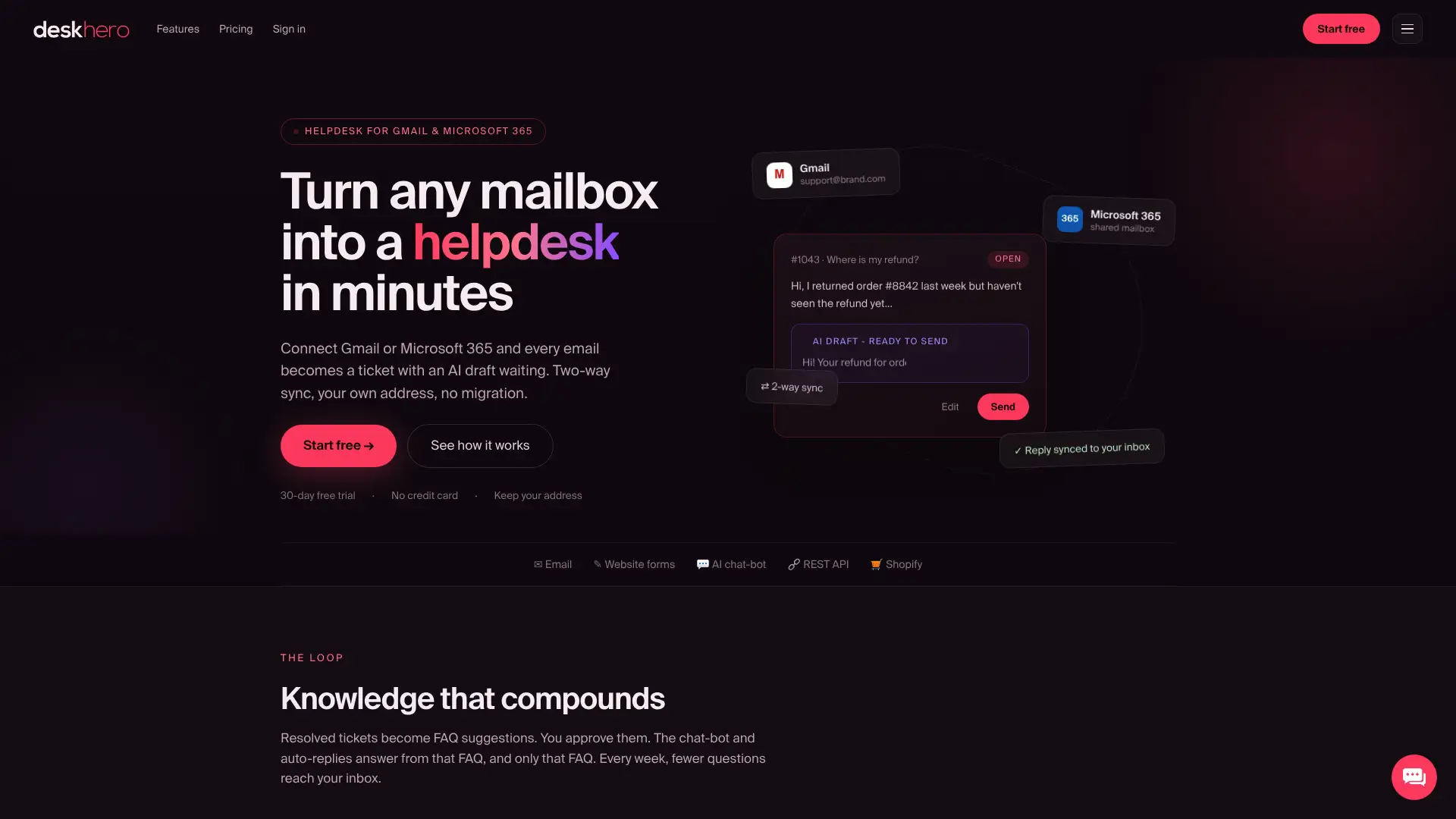
The Dashboard shows status breakdowns, work awaiting a first reply, ticket-volume trends, and response and resolution times. Statistics adds fixed views for trends, response times, SLA performance, team activity, channels, AI and automation, and recurring topics. SLA risk can generate in-app and email alerts. For external analysis, the Deskhero helpdesk platform also provides a REST API that reporting tools can poll.
Start a 30-day free trial with no credit card. You can keep your existing email address.
Useful sources
- Customer Support Metrics That Drive Real Impact, SigOS.
- Live customer service dashboards for your whole support team, Geckoboard.
- Customer Support Dashboard for the Office TV, BoardQ.
- 20 Essential Customer Support Metrics to Track, Fullview.
- AI-Powered CSAT Dashboard, Merren.
- Customer Service Metrics: Top 10 to Measure, Qualtrics.
- How to reduce churn in self-service SaaS, Customerscore.io.
FAQ
What is a customer support dashboard?
A customer support dashboard is a real-time or scheduled view of key support metrics, such as queue depth, FRT, CSAT, and SLA compliance, that helps managers and Users monitor performance and act on signals quickly.
What are the four core metrics of customer service?
The four most commonly tracked customer service metrics are CSAT (customer satisfaction), FCR (first contact resolution), FRT (first response time), and AHT (average handle time). These form the Tier 1 foundation of any support dashboard.
What is a CSAT dashboard?
A CSAT dashboard tracks customer satisfaction survey results over time, showing score trends, survey response rates, and customer comments. A daily refresh can help managers identify coaching targets and quality issues.
What are the main types of support dashboards?
The main types are the live operational wallboard, the manager queue view, User scorecards, the CSAT and quality dashboard, the SLA and aged ticket monitor, and the strategic or executive risk dashboard. Each serves a different audience and decision cadence.
How do you analyze support data effectively?
Start by tiering your metrics: Tier 1 for daily operational decisions, Tier 2 for workload health, and Tier 3 for business-impact signals. Join ticket data with CRM and billing records to move beyond raw volume and connect support performance to retention and revenue outcomes.