Helpdesk Reporting Metrics That Support Managers Should Track

The essential helpdesk reporting metrics are ticket volume, first response time, mean time to resolve (MTTR), first-contact resolution (FCR), CSAT, SLA compliance, backlog and aging, reopen rate, escalation rate, User utilization, cost per ticket, and channel volume. Track them together as one set, not as a menu to pick from, because isolating any single number invites bad incentives: chase speed alone and reopen rates climb; chase CSAT alone and cost per ticket can rise.
The point of pulling helpdesk reporting metrics into one view is to cover four jobs at once: efficiency, quality, workload, and cost. Miss one, and you’re managing on a partial picture.
Here’s the working list to put on a dashboard today:
- Ticket volume: total and by channel, so staffing tracks demand
- First response time (FRT): how long customers wait for an initial substantive reply
- MTTR: median resolution time, sliced by priority
- FCR: percentage resolved without escalation or follow-up
- CSAT: post-ticket satisfaction score
- SLA compliance: percentage of tickets meeting response and resolution targets
- Backlog and aging: open tickets grouped by how long they have been waiting
- Reopen rate: tickets closed then reopened within a set window
- Escalation rate: percentage routed to tier 2 or above
- User utilization: active work time versus available capacity
- Cost per ticket: total support cost divided by ticket volume
- Channel volume: split by email, chat, phone, and self-service
Your next move: build a one-page weekly dashboard showing volume, FRT, MTTR, CSAT, and backlog age. That’s the fastest way to see, in fifteen minutes, whether the week went sideways.
Key Takeaways
Helpdesk reporting works when managers track efficiency, quality, workload, and cost metrics together instead of optimizing any single number in isolation.
| Point | Details |
|---|---|
| Track the full set | Combine FRT, MTTR, FCR, CSAT, SLA compliance, backlog age, reopen rate, escalation rate, utilization, and cost per ticket. |
| Pair FCR with reopen rate | High FCR alone can hide premature closures; reopen rate catches what FCR misses. |
| Build audience-specific dashboards | Executives need trend and cost; managers need workload and risk; Users need their own queue. |
| Use real-time for operations, historical for strategy | Queue depth and SLA timers drive same-day decisions; trend data drives hiring and process changes. |
| Automate the data pipeline | Deskhero structures tickets from email, forms, and its AI chatbot in one system and provides fixed Statistics views with Excel exports. |
Table of Contents
- What Are Helpdesk Reporting Metrics and KPIs?
- The 14 Essential Helpdesk Metrics: Definitions, Formulas, and Actions
- How Should Dashboards Differ for Executives, Managers, and Users?
- Real-Time vs. Historical Reporting: Which Do You Need?
- How Do You Set Realistic SLA and CSAT Targets?
- What Reporting Mistakes Should Managers Avoid?
- What Belongs in a Weekly Report vs. a Monthly Report?
- How Do You Actually Calculate These Metrics From Raw Data?
- How Should IT Support Metrics Differ From Customer Service Metrics?
- Can Trend Analysis and Forecasting Improve Helpdesk Planning?
- Why This Metric Set Works for Modern Helpdesks
- Put These Reporting Practices Into Your Helpdesk
- Sources
- FAQ
What Are Helpdesk Reporting Metrics and KPIs?
A metric is any number you measure. A KPI is a metric tied to a target that tells you whether performance is acceptable. Ticket volume is a metric; “resolve 90% of tickets within 8 business hours” is a KPI built on top of a metric.
Helpdesk reporting metrics generally fall into four buckets, and knowing which bucket you’re looking at keeps you from over indexing on one dimension:
- Productivity metrics: ticket volume, User utilization, tickets closed per User per day
- Efficiency metrics: first response time, MTTR, time to first response by channel
- Quality metrics: CSAT, FCR, reopen rate, QA scores
- Cost metrics: cost per ticket, cost per resolved issue, overtime hours tied to backlog spikes
The mistake most teams make is picking metrics because a tool happens to report them, not because they map to a business goal. If your leadership cares about retention, CSAT and reopen rate may matter more than raw ticket count. If leadership cares about headcount planning, ticket volume and User utilization may matter more than CSAT. Start from the decision you need to make, then pick the metric that informs it.
The 14 Essential Helpdesk Metrics: Definitions, Formulas, and Actions
Each of these functions as a manager’s tool, not a scoreboard. Here’s what each one means, how to calculate it, how to slice it, and what to actually do when it moves.
Ticket volume. Total tickets received in a period. Formula: count of new tickets, sliced by channel, priority, and category. When volume spikes without a corresponding product change, check for a bug, an outage, or a marketing campaign driving traffic. Sustained volume growth without headcount growth is your earliest warning sign for backlog trouble.
Channel volume. Ticket volume broken down by intake source: email, embedded web forms, chat, phone. This tells you where to invest in deflection. If chat volume triples while resolution quality lags, that’s a training gap, not a staffing gap.
First response time (FRT). Time from ticket creation to the first substantive User reply. Formula: sum of (first response timestamp minus creation timestamp) divided by ticket count. Slice by channel and priority. FRT is useful because it measures the first wait a customer experiences. When FRT creeps up, inspect routing, staffing, and demand before choosing a fix. Auto-acknowledgments should be measured separately from substantive replies. Deskhero’s AI auto-replies count as a first response and are identified separately from human replies.
Mean time to resolve (MTTR). Average or median time from creation to resolution. Formula: sum of (resolved_at minus created_at) divided by resolved ticket count. Use median alongside the mean when multi-day outliers distort the average. Slice by priority and category. A rising MTTR on low-priority tickets while urgent tickets stay flat can point to a triage or capacity problem.
First-contact resolution (FCR). Percentage of tickets closed in a single interaction with no follow-up or escalation. Formula: tickets resolved on first contact divided by total tickets, times 100. FCR and reopen rate should always be read together. A high FCR with a climbing reopen rate can mean Users are closing tickets prematurely.
CSAT. Post-resolution satisfaction score, usually a 1 to 5 rating tied to a closing survey. Formula: satisfied responses divided by total responses, times 100. Slice by User, category, and channel. A CSAT dip in one category, such as billing, while overall CSAT holds steady can reveal where coaching or process review is needed.
NPS or CES, when tracked. Net Promoter Score measures loyalty; Customer Effort Score measures how hard the interaction felt. Neither replaces CSAT, but CES in particular is useful for identifying friction in self-service flows before customers ever open a ticket.
SLA compliance. Percentage of tickets meeting contracted response and resolution windows. Formula: tickets within SLA divided by total tickets, times 100. Slice by priority tier, since a single blended SLA number hides the fact that your urgent-ticket compliance might be failing while low-priority compliance looks fine.
Backlog and aging. Open ticket count grouped into age buckets (0 to 24 hours, 1 to 3 days, 3+ days). A growing tail of older tickets can signal a capacity or workflow problem before an SLA target is missed.
Reopen rate. Percentage of resolved tickets reopened within a defined window, commonly 48 hours. Formula: reopened tickets divided by resolved tickets, times 100. Pairing reopen rate with FCR helps reveal whether faster closure is coming at the expense of durable resolution.
Escalation rate. Percentage of tickets routed beyond tier 1. Formula: escalated tickets divided by total tickets, times 100. Rising escalation with flat ticket volume can signal a knowledge gap, a routing issue, or a change in ticket complexity.
User utilization. Active working time divided by scheduled available time. Formula: time spent on tickets divided by scheduled hours, times 100. Sustained overutilization can increase burnout risk, so interpret the number alongside workload and leave.
Cost per ticket. Total support cost (salaries, tools, overhead) divided by ticket volume for the period. This gives managers and finance a common way to discuss the cost of support.
QA or quality scores. Manual or AI-assisted scoring of ticket transcripts against a rubric, covering tone, accuracy, and policy adherence. QA can add context that satisfaction surveys miss, especially when survey response volume is low.
| Metric | Formula | Primary audience |
|---|---|---|
| Ticket volume | Count of new tickets by period | Manager, executive |
| First response time | Sum(first reply time − created time) / tickets | User, manager |
| MTTR | Median(resolved time − created time) | Manager, executive |
| FCR | First-contact resolutions / total tickets × 100 | Manager |
| CSAT | Satisfied responses / total responses × 100 | Manager, executive |
| SLA compliance | Tickets within SLA / total tickets × 100 | Manager, executive |
| Backlog aging | Open tickets grouped by age bucket | Manager, User |
| Reopen rate | Reopened tickets / resolved tickets × 100 | Manager |
| Escalation rate | Escalated tickets / total tickets × 100 | Manager |
| User utilization | Active work time / scheduled time × 100 | Manager |
| Cost per ticket | Total support cost / ticket volume | Executive |
| QA score | Weighted rubric score per ticket | Manager, User |
For a full breakdown of how these definitions apply across different team sizes, see the essential helpdesk reporting metrics for support managers.
How Should Dashboards Differ for Executives, Managers, and Users?
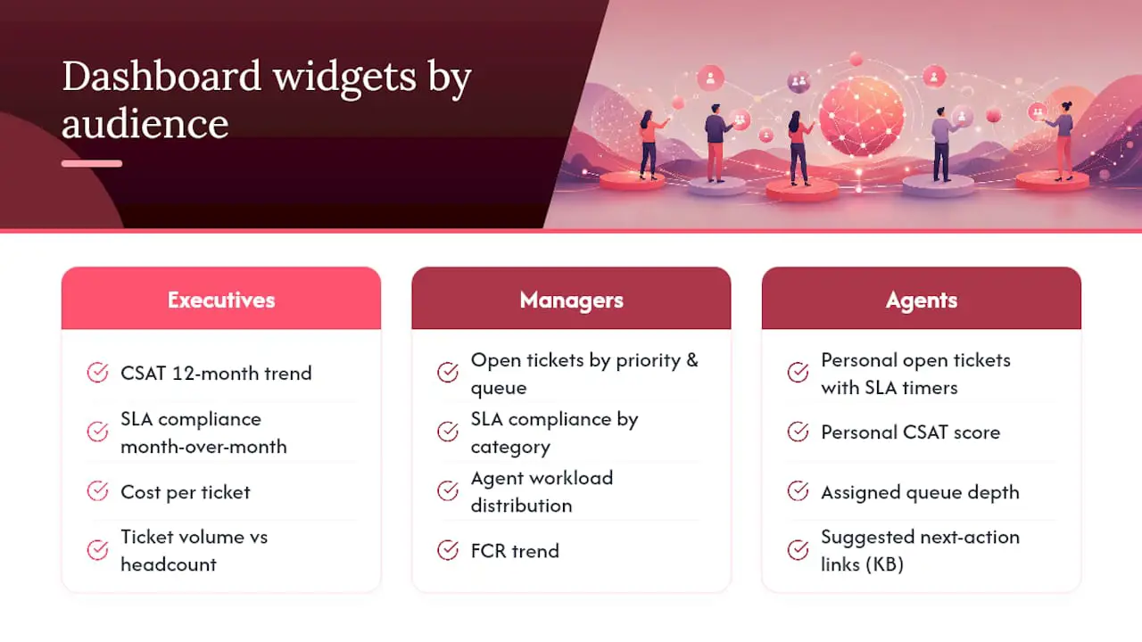
Executives need trend and cost. Managers need workload and risk. Users need a focused view of their own queue. A single dashboard rarely serves all three audiences well, so start with the decisions each group needs to make.
Executive widgets: CSAT trend over 12 months, overall SLA compliance with month-over-month comparison, cost per ticket, ticket volume plotted against headcount, and a short list of top risk items pulled from escalations.
Manager widgets: current open ticket count by priority and queue, SLA compliance by category, User workload distribution, FCR trend, escalation rate, backlog age distribution, and rolling QA averages.
User widgets: personal open tickets, assigned queue depth, approaching SLA deadlines, and relevant knowledge links.
Pro Tip: Keep each dashboard focused. Add drill-down links instead of piling on more tiles, and remove widgets that do not drive a recurring decision.
Refresh cadence matters as much as widget choice. Queue depth, SLA deadlines, and User assignment need current data because they drive same-day decisions. CSAT trends, cost per ticket, and QA averages can update daily or weekly because they inform decisions that play out over longer periods. Current operational data helps managers spot overloaded queues and redistribute work before deadlines slip.
Real-Time vs. Historical Reporting: Which Do You Need?
Real-time reporting drives operational decisions made in the moment; historical reporting drives strategic decisions made over weeks or quarters. Confusing the two is how teams end up staring at a live dashboard during a hiring conversation, or pulling a quarterly report to decide who covers the afternoon shift.
| Purpose | Refresh rate | Time horizon | Key metrics | Audience |
|---|---|---|---|---|
| Operational (routing, staffing) | Real-time to hourly | Same day | Queue depth, SLA deadlines, User status | Manager, User |
| Strategic (hiring, process) | Daily to monthly | Weeks to quarters | MTTR trend, CSAT trend, cost per ticket | Manager, executive |
Operational dashboards should drive routing and staffing calls, while historical reports are the right vehicle for hiring decisions, training investments, and process changes. Mixing the two just produces noisy, reactive management.
On the data side, three habits fix most reporting headaches: unify every ticket source into one system before reporting on it; validate that status timestamps reflect reality; and automate repeatable exports when a built-in report is not enough. A ticket marked “resolved” days after the customer’s problem was fixed will distort MTTR regardless of the reporting tool.
On tool choice, the deciding factor is usually where your data already lives. Power BI often fits Microsoft-heavy environments, while Tableau is commonly used to blend several sources. Whichever you pick, make sure your export or API includes ticket ID, timestamps for relevant status changes, priority, category, assignee, and channel. Confirm the exact fields against the calculations your dashboard will use.
How Do You Set Realistic SLA and CSAT Targets?
Set targets by measuring your baseline first, comparing it to a peer benchmark, then phasing improvement over a defined timeline instead of jumping straight to an arbitrary “best-in-class” number.
- Measure your current baseline for each metric across at least four to six weeks, long enough to smooth out one bad week.
- Choose a benchmark band from industry sources or comparable teams, adjusted for your support model (a B2B SaaS helpdesk and a high-volume e-commerce team shouldn’t target the same MTTR).
- Set a phased target with a timeline, for example, moving SLA compliance from 82% to 90% over two quarters rather than demanding 95% next month.
- Tie targets to capacity planning so improvement goals come with the staffing or automation investment needed to hit them, not just a mandate.
Document the definition, data source, baseline, target, and review date for every KPI. Benchmark reports can provide context, but your target should reflect channel, severity, customer promise, operating hours, and available capacity.
What Reporting Mistakes Should Managers Avoid?
The most common mistakes are chasing vanity metrics, reporting averages instead of percentiles, rewarding speed without checking quality, and letting dashboards run siloed by team.
- Tracking average instead of percentile times hides your worst cases. Report median and 90th-percentile MTTR side by side.
- Rewarding speed alone (fast closures, high FCR) without watching reopen rate can incentivize Users to close tickets before the problem is actually fixed.
- Ignoring reopen rate leaves a quality gap; add it if your ticketing tool does not surface it by default.
- Treating all channels the same masks the fact that chat and email have wildly different FRT expectations.
- Poor data hygiene (duplicate tickets, mislabeled priority) quietly corrupts every downstream metric; audit ticket tagging quarterly.
What Belongs in a Weekly Report vs. a Monthly Report?
Weekly reports cover operational health; monthly reports cover trend and business impact.
- Ticket volume and channel split for the week
- FRT, MTTR, CSAT, and FCR against target
- SLA compliance broken out by category
- Top five ticket categories by volume
- User workload distribution and any capacity flags
- One paragraph summarizing the week’s key story
For the monthly executive report, cover month-over-month and year-over-year trends for CSAT, SLA compliance, and cost per ticket, staffing levels against demand, a short note on initiatives launched and their measured impact, and any forward-looking risks like seasonal volume spikes.
A usable narrative sentence might read: “Volume rose 14% this week after a billing bug, SLA compliance dipped to 84% on urgent tickets, and we recommend temporary overflow staffing until the fix ships.” The figures are illustrative, but the structure gives the reader a change, cause, consequence, and action. For ready-made layouts, see Deskhero’s customer support dashboard templates.
How Do You Actually Calculate These Metrics From Raw Data?
Accurate calculation depends on one thing more than any formula: consistent status timestamps and a clear, agreed definition of “resolved” versus “closed.” If half your team marks a ticket resolved when the fix ships and the other half marks it resolved when the customer confirms, your MTTR is comparing two different things.
- FRT = first_response_at − created_at, averaged or medianed per period
- MTTR = resolved_at − created_at, medianed and sliced by priority
- FCR = (tickets with zero reassignments and zero reopens) / total tickets
- Reopen rate = tickets reopened within 48 hours / resolved tickets
- User utilization = time_spent / scheduled_hours
- SLA compliance = tickets meeting SLA / total tickets
Required raw fields: ticket ID, created_at, first_response_at, resolved_at, closed_at, status change log, priority, queue, assignee, time_spent, and cost center.
A simple query for FRT and MTTR over a date range looks like this:
SELECT AVG(first_response_at - created_at) AS avg_frt,
       PERCENTILE_CONT(0.5) WITHIN GROUP (ORDER BY resolved_at - created_at) AS median_mttr
FROM tickets
WHERE created_at BETWEEN :start_date AND :end_date;
Treat this as a starting shape, then adapt the syntax and timestamp rules to your database. Validate the result against a small set of known tickets before relying on it in a dashboard.
How Should IT Support Metrics Differ From Customer Service Metrics?
IT support and customer-facing support measure success differently, even though both run on ticket queues. IT support metrics lean toward MTTR, escalation rate, and SLA compliance tied to incident severity, because the cost of downtime dwarfs the cost of a slightly slow reply. A P1 outage ticket needs a different SLA clock and a different escalation path than a password reset request, and blending them into one MTTR number hides both.
Customer service and e-commerce support, by contrast, may weight CSAT, FCR, and channel volume more heavily because the business impact shows up in retention and repeat purchases rather than system uptime. A Shopify merchant handling order status questions may care more about FRT on customer channels than about MTTR on a rare technical escalation. Deskhero’s Shopify integration adds live customer, order, fulfillment, and tracking context to matching tickets, while its product catalog can inform AI reply drafts.
The fix isn’t picking one metric set over the other. It’s segmenting your dashboard by support model when your team handles both, so an internal IT queue and a customer-facing queue get separate SLA tiers, separate escalation rules, and separate benchmark targets instead of one blended number that fits neither well.
Can Trend Analysis and Forecasting Improve Helpdesk Planning?
Trend analysis turns a snapshot metric into a planning tool, and forecasting lets you staff ahead of demand instead of reacting to it. A flat CSAT number tells you where you stand today; a 12-month CSAT trend line tells you whether last quarter’s process change actually worked.
The most practical use is volume forecasting. If ticket volume reliably spikes every November due to a product launch cycle, plotting that seasonal pattern against headcount lets you request temporary staffing in advance. The same logic applies to escalation rate: a sustained rise can prompt investigation before SLA compliance deteriorates.
Support analytics can serve two distinct jobs: keeping the queue healthy day to day, and mining ticket content for recurring themes that feed product and customer experience teams. Track both operational performance and recurring topics so the reporting program supports more than queue management.
Why This Metric Set Works for Modern Helpdesks
The mistake I see most often isn’t picking bad metrics. It’s picking good metrics in isolation. A team that reports FCR without reopen rate looks great on paper right up until customers start filing the same complaint twice. Pairing efficiency numbers with a quality check is what actually protects a helpdesk from optimizing itself into worse service.
This grouping, efficiency, quality, workload, and cost together, works because it mirrors how staffing and product decisions actually get made. You don’t hire off CSAT alone or route tickets off cost per ticket alone. You need the full set, read together, every week.
Put These Reporting Practices Into Your Helpdesk
Building reports by hand from separate email and form exports creates avoidable work. Deskhero turns a Gmail or Microsoft 365 mailbox into a helpdesk and stores email, embedded form, and AI chatbot tickets in one system. Its Dashboard shows ticket volume, average first reply time, average resolution time, and time per status. The fixed Statistics area adds trends, response-time percentiles, SLA, team, channel, AI, and topic views with filters and per-tab Excel exports.
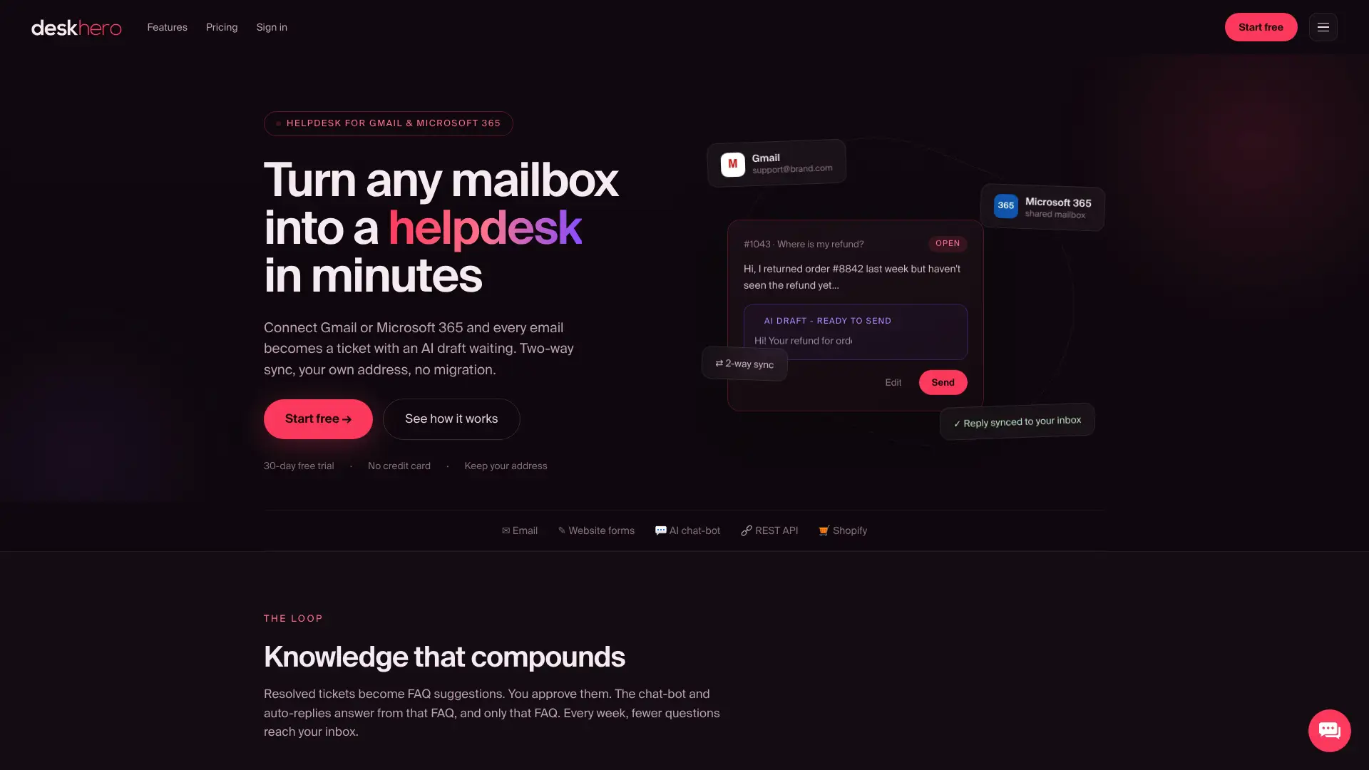
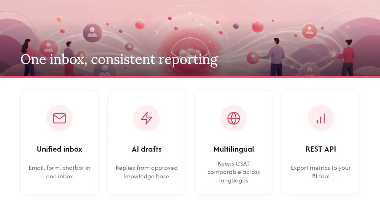
Tickets created by email, an embedded website form, or the built-in AI chatbot land in one shared inbox. AI reply drafts can use the workspace’s broader knowledge pool, while customer-facing chatbot answers and AI auto-replies use only the approved public FAQ. Multilingual support helps Users translate tickets and replies. The Topics cluster highlights recurring themes, while Statistics exports and the REST API provide routes into further analysis. Deskhero does not include a custom report builder, so teams that need a bespoke dashboard should use the exported or API-accessible data in a BI tool.
If you are rebuilding your reporting workflow, you can start a 30-day free trial with no credit card required and explore the Dashboard and Statistics views in Deskhero.
Sources
These sources back the benchmarks, dashboard design rules, and tool guidance covered above, and each one goes deeper into a specific piece of the picture.
- Help Desk Reporting & Dashboards Guide 2026 | HelpDeskFocus
- Help desk metrics to track for better IT support | HubSpot
- The 6 Best Customer Support Analytics Tools
FAQ
What are the key metrics for service desk reporting?
The core set includes ticket volume, first response time, MTTR, FCR, CSAT, SLA compliance, backlog aging, reopen rate, escalation rate, User utilization, and cost per ticket, tracked together rather than one at a time.
What are the 5 key CX metrics?
Most teams anchor CX reporting on CSAT, FCR, first response time, reopen rate, and SLA compliance, since these five combine speed, quality, and reliability into a single readable picture.
What are some examples of KPIs for an IT help desk?
IT help desk KPIs typically include MTTR by severity tier, SLA compliance on P1 incidents, escalation rate, and backlog aging, because IT support weighs incident severity more heavily than general customer service does.
What are good KPIs for an IT department?
Beyond ticket-level metrics, IT departments often track cost per ticket, User utilization, and first-contact resolution to balance service quality against staffing cost and capacity.
How often should helpdesk reports run?
Operational widgets like queue depth and SLA deadlines need current data, while trend metrics like CSAT and cost per ticket can often use a weekly or monthly cadence.
Can a helpdesk platform like Deskhero handle this reporting automatically?
Deskhero captures tickets from email, web forms, and its AI chatbot in one system. Its fixed Statistics tabs cover trends, response times, SLA, Users, channels, AI, and topics, with filters and per-tab Excel exports. A REST API is also available for teams that need further analysis.