Which Helpdesk Reporting Metrics Actually Matter

If you build only one thing this week, build a one-page weekly manager dashboard that puts all eight in front of your team every Monday morning. Everything else, including hourly user widgets and quarterly executive decks, can wait until that single report is reliable.
Here’s what each metric actually tells you:
- First response time answers: how long do customers wait to hear from a human?
- MTTR answers: how long does a problem actually take to close, start to finish?
- First contact resolution answers: are users solving issues on the first try, or bouncing tickets around?
- CSAT answers: are customers happy with how their issue was handled?
- SLA compliance answers: are you meeting the response and resolution promises you made?
- Ticket volume and backlog answer: is incoming demand outpacing your team’s capacity?
- Reopen rate answers: are “resolved” tickets actually staying resolved?
- Cost per ticket answers: what does each support interaction cost the business?
None of these numbers means much in isolation. A fast FRT paired with a low FCR just means you’re answering quickly and getting it wrong. The real skill in helpdesk reporting metrics is choosing the right combinations, segmenting them correctly, and routing the right view to the right person.
Key Takeaways
Reliable helpdesk reporting comes down to tracking eight core metrics consistently, segmenting them correctly, and routing the right view to the right audience on a fixed cadence.
| Point | Details |
|---|---|
| Start with eight metrics | Track FRT, MTTR, FCR, CSAT, SLA compliance, backlog ratio, reopen rate, and cost per ticket. |
| Build the weekly dashboard first | A one-page manager report beats a sprawling multi-tab system nobody checks. |
| Match dashboards to audience | Executives need trends, managers need daily operational views, users need real-time personal queues. |
| Pair metrics to catch gaming | Watch FCR alongside reopen rate, and FRT alongside CSAT, to see the full picture. |
| Deskhero provides fixed reporting views | Its Statistics area covers ticket trends, response times, SLA, team activity, AI and automation, channels, and topics. |
Table of Contents
- Helpdesk Reporting Metrics vs KPIs: What’s the Difference?
- Core Help Desk Metrics: Definitions, Formulas, and Benchmarks
- How to Measure Correctly and Avoid Common Pitfalls
- Design Dashboards by Audience: Executive, Manager, and User Views
- Reporting Cadence and Sample Report Templates
- Turning Metric Signals Into Action
- Data Governance: Making Sure the Numbers Can Be Trusted
- Getting These Reports Running Without the Manual Work
- Sources
- FAQ
Helpdesk Reporting Metrics vs KPIs: What’s the Difference?
A metric is any number you can measure. A KPI is a metric your organization has decided matters enough to set a target for and act on regularly. Ticket volume is a metric. “Keep average ticket volume under 40 per user per day” is a KPI. A benchmark, meanwhile, is an external reference point, like an industry average, that tells you whether your KPI target is realistic in the first place.
This distinction matters because support teams can collect many metrics without deciding which ones deserve a target and a regular response. A compact core set is easier to review consistently. Add a measure only when someone owns it and knows what action a change should trigger.
Group your metrics by what question they answer, and the reporting design gets much simpler:
Speed metrics (FRT, MTTR) tell you how fast the team is moving. Quality metrics (CSAT, FCR, reopen rate) tell you whether that speed is producing good outcomes. Compliance metrics (SLA attainment) tell you whether you’re meeting contractual or internal promises. Efficiency metrics (cost per ticket, team utilization) tell you what it costs to run the operation. Volume metrics (ticket count, backlog) tell you about demand.
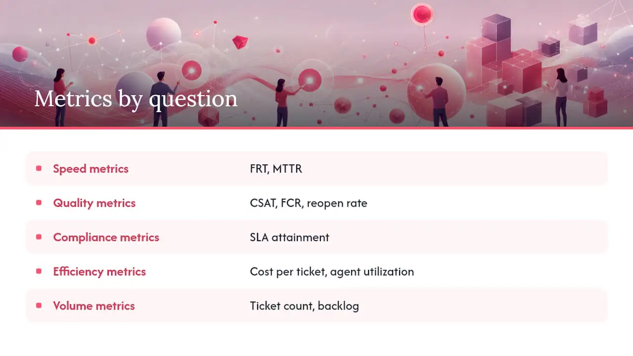
Executives generally care about efficiency and quality trends over months. Managers need compliance and volume views checked daily or weekly. Users need speed and quality metrics scoped to their own queue. Mixing every audience on one dashboard can bury the information each person needs.
Core Help Desk Metrics: Definitions, Formulas, and Benchmarks
Here’s the reference sheet. Define each metric explicitly, segment it along these lines, and set targets from your own service commitments and historical baseline.
First response time (FRT) measures the elapsed time between a ticket’s creation and the first substantive human reply. Report both a median and a higher percentile when possible, and exclude automatic acknowledgments. Segment by channel and priority because customers have different expectations for email, chat, and phone.
Resolution time, often summarized as mean time to resolution (MTTR), measures the lifecycle from ticket creation to resolution or close. Report the median alongside or instead of the mean when a small number of complex tickets would distort the result. Segment by priority and issue type, and define how waiting on the customer affects the clock.
First contact resolution (FCR) measures the share of tickets resolved without a follow-up interaction. Define “first contact” clearly, then segment by category and user tenure so changes in ticket mix do not masquerade as changes in performance.
Customer satisfaction (CSAT) measures the share of positive survey responses. Report the response count and response rate beside the score because a small or self-selecting sample can be misleading. Segment by issue category before comparing users.
SLA compliance measures the percentage of tickets meeting your defined response and resolution time commitments. Segment by SLA tier and customer contract type; blending enterprise and free-tier SLAs into one number hides the story.
Ticket volume and backlog measure incoming demand and the queue of unresolved work. Track backlog as both a raw count and a ratio (open tickets divided by average daily resolution capacity) so you can see whether the queue is growing faster than the team can clear it.
Reopen rate measures the percentage of resolved tickets that get reopened within a defined window, typically 48 to 72 hours. Segment by user and category. This is the metric that keeps FCR honest.
Cost per ticket measures total support operating cost divided by ticket volume for a given period. Segment by channel, since phone support typically costs far more per ticket than email or chat.
| Metric | Formula | Segment by | Benchmark starting point |
|---|---|---|---|
| First response time | Time to first human reply | Channel, priority | Set by channel and support hours |
| MTTR (median) | Time from open to close | Priority tier | Set by priority and issue type |
| First contact resolution | First-contact closes ÷ total tickets | Category, user tenure | Use a historical baseline |
| CSAT | Positive responses ÷ total responses | User, category | Show score, responses, and response rate |
| SLA compliance | Tickets met ÷ total tickets | SLA tier, contract type | Set per contract |
| Reopen rate | Reopened tickets ÷ resolved tickets | User, category | Pair with FCR |
Two metrics only make sense together: first contact resolution and reopen rate within 48 hours. A high FCR paired with a rising reopen rate means users are closing tickets to hit a target, not because the issue is actually fixed.
How to Measure Correctly and Avoid Common Pitfalls
Precision in how you calculate a metric matters more than which metric you pick. Use median rather than mean for any time-based metric with a long tail, which in practice means almost every resolution-time number you report. A single ticket that takes three weeks to close because it’s stuck waiting on a vendor will drag your average resolution time up in a way that misrepresents the whole team’s performance.
Count the first human reply as your FRT, not the automated “we got your message” confirmation. If your system logs the auto-response as the first touch, your FRT numbers will look artificially fast and mask a real staffing problem. Define your reopen window explicitly, whether it’s 24, 48, or 72 hours, and apply it consistently across every category so you’re comparing like with like. Align your reporting clock to your actual support hours; a ticket submitted at 11 p.m. Friday and answered at 9 a.m. Monday shouldn’t count the same as a three-day miss during business hours if your team doesn’t staff weekends.
A common pitfall is averaging a metric across channels that behave differently. Blending email FRT with chat FRT produces a figure that describes neither channel well. Another is reporting first contact resolution without reopen rate, which can reward premature closure. CSAT also needs its sample size and response rate, not just the headline score.
Pro Tip: Run a quick sanity check before presenting a report. Sample a few tickets marked “within SLA” and compare their timestamps with the report. Any mismatch deserves investigation before the number is used for a decision.
View FRT next to CSAT, and view backlog ratio next to SLA breach count. These pairings catch problems a single number hides. A team can hit every SLA target on paper while backlog quietly triples, because SLA compliance measures the tickets you handled, not the ones piling up behind them.
Design Dashboards by Audience: Executive, Manager, and User Views
Different audiences need different views. A dashboard built for a user’s current workload is too detailed for an executive judging quarterly trends, while a strategic executive view is too slow-moving to help someone manage today’s queue.

Executives need trend lines, not live counters. Put CSAT trend over time, cost per ticket by month, ticket volume against headcount, MTTR trend by quarter, SLA attainment trend, and a top-line backlog trajectory on their view. They’re checking this monthly, sometimes weekly, to spot whether the support function is scaling sanely with the business.
Managers need operational detail refreshed daily. Their dashboard should show open tickets by priority in real time, SLA compliance broken out by category, user workload distribution, today’s ticket volume against the daily average, backlog age distribution, and reopen rate by user. This is the view that drives staffing decisions and daily triage calls.
Users need a narrow, personal, real-time view: their own open tickets with SLA countdown timers, their personal CSAT score, their FCR rate, and a queue of tickets awaiting their reply sorted by urgency. Anything beyond their own workload is noise that slows them down.
| Dashboard type | Refresh rate | Time horizon | Key metrics | Primary audience |
|---|---|---|---|---|
| Real-time operational | Live to hourly | Today | Open tickets, SLA timers, queue depth | Users, managers |
| Weekly tactical | Daily to weekly | This week vs last | Volume, backlog ratio, user workload | Managers |
| Strategic trend | Weekly to monthly | Month/quarter/year | CSAT trend, cost per ticket, MTTR | Executives |
Real-time operational views help managers redistribute work before a queue breaches its targets. Historical reports serve a different purpose: they show whether workload, quality, and response patterns are improving over time.
Most small and mid-sized teams do not need a full BI integration right away. Built-in helpdesk reporting can cover operational and weekly reviews. Add a tool such as Looker Studio or Power BI when you need to combine support data with revenue, staffing, or other business systems. For many teams, a focused customer support dashboard is enough for a weekly review.
Your one-page KPI checklist for a weekly review should fit without scrolling: FRT, MTTR (median), FCR, CSAT, SLA compliance, backlog ratio, reopen rate, and cost per ticket. Eight numbers, one screen, no digging.
Reporting Cadence and Sample Report Templates
Cadence should match how fast a metric can meaningfully change and how fast someone needs to act on it. Here’s a structure you can copy directly.
-
Daily alerts. Set triggers for tickets approaching an SLA deadline, unusual volume changes, and growth in the critical-priority queue. Choose thresholds from your operating baseline and send alerts through channels your team actively monitors.
-
Weekly manager report. Structure it as this week versus last week versus the same week last year, with a two-sentence narrative up top explaining the biggest change. Follow with the top five ticket categories by volume, a user workload view showing where capacity is tight, and the core KPI set (FRT, resolution time, FCR, CSAT, SLA compliance, backlog ratio). Send it before the team’s weekly review.
-
Monthly business report. Built for directors and executives, this covers month-over-month and year-over-year trends across the same core metrics, cost per ticket by channel, a staffing analysis comparing headcount to volume growth, and a short forward-looking risk note, such as an upcoming product launch expected to spike ticket volume. This is the report that justifies (or challenges) headcount requests.
Many helpdesk platforms provide prebuilt operational views. Treat those as a starting point, then remove fields nobody acts on and define every calculation before using it as a KPI.
Turning Metric Signals Into Action
A report that just sits in an inbox is wasted effort. Every metric that moves in the wrong direction should trigger a specific, assigned response, not a vague conversation about “keeping an eye on it.”
Rising backlog. Check whether it’s a volume problem or a throughput problem first. If volume is up, deploy a temporary triage team or open a self-service deflection path through an AI chat-bot for common questions. If throughput is down, check for a training gap or a broken routing rule. Owner: support manager. Watch backlog ratio daily for a week after the fix.
Falling FCR. Pull the categories dragging the number down and check whether it’s a knowledge gap. Often it’s one or two issue types repeatedly bouncing between users. Update the internal knowledge base with a clear resolution path for that category and retrain the team on it. Owner: team lead. Re-check FCR by category after two weeks, not immediately, since users need time to internalize new guidance.
Falling CSAT. Compare the change with FRT and time to resolution for the same period to see whether slower service is contributing. If speed is stable, read the negative-response tickets and group the reasons. Owner: manager. Review the score together with response count and response rate.
Rising reopen rate. Compare it with FCR. The combination may indicate tickets are being closed before the issue is fully resolved. Review the affected categories and tickets before changing coaching or incentives. Owner: manager. Watch weekly.
Rising cost per ticket. Check channel mix first because phone, email, and chat have different cost structures. If the mix is stable, examine staffing, overtime, tooling, and case complexity. Owner: director. Review monthly because this metric usually moves more slowly than queue measures.
Pro Tip: Choose an evaluation window before making a change. It should be long enough to include a representative volume of tickets and at least one normal reporting cycle.
Routing and documentation changes may affect operational metrics sooner than hiring or a training overhaul. Match the review window to the intervention and ticket volume rather than declaring success from a single good day.
Data Governance: Making Sure the Numbers Can Be Trusted
None of this works if the underlying data is wrong, and it usually is somewhere. Every core metric needs a named owner responsible for its definition, a documented calculation method that doesn’t change without notice, a defined refresh cadence, and a rule for handling missing or malformed data.
Build a short governance checklist and revisit it quarterly:
- Assign one owner per metric who signs off on any change to its definition.
- Document the exact calculation formula somewhere the whole team can see it, not just in one manager’s head.
- Set a fixed data refresh cadence and alert on any gap in that cadence, since a silently broken data pipeline is worse than no report at all.
- Set a minimum response count or rate before publishing CSAT, based on your ticket volume and desired confidence.
- Run periodic sample ticket audits, pulling 10 to 15 random tickets a month and manually checking timestamps and categorization against the report.
- Investigate sudden changes that have no matching operational event because they may indicate a definition, tagging, or integration problem.
For benchmarks, prefer sources that publish their methodology and sample. Use external figures only as context, then set targets from your own service commitments, ticket mix, support hours, and historical baseline.
A practical note on doing this well
Most teams fail at helpdesk reporting not because they pick the wrong metrics but because they try to track twenty of them from day one and abandon the whole effort within a month. Eight metrics tracked consistently and acted on every week will teach you more about your support operation than thirty metrics glanced at occasionally.
Start with the one-page weekly manager dashboard. Get it right for a month before you touch executive reporting or build out individual user widgets. It’s tempting to build the full system on day one because the tooling makes it easy, but the discipline of watching eight numbers closely beats the illusion of watching thirty.
For a small or mid-sized team without a dedicated analytics person, Deskhero provides fixed Statistics views for trends, response times, SLA, team activity, AI and automation, channels, and topics.
Getting These Reports Running Without the Manual Work
Much of the friction in helpdesk reporting comes from scattered conversations, inconsistent ticket fields, and repeated spreadsheet work. Deskhero connects Gmail or Microsoft 365 mailboxes to a shared helpdesk. Its Statistics area reports on ticket trends, response times, SLA attainment, team activity, channels, AI and automation, and topic patterns.
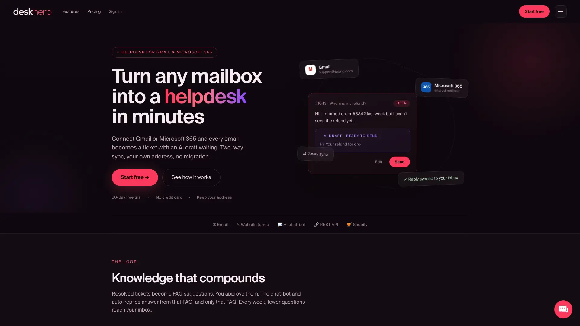
Two-way email sync keeps incoming messages and replies in the ticket history used for response-time reporting. AI reply drafts draw on workspace knowledge, including answered tickets, internal knowledge, approved public FAQ entries, scraped website pages, and connected Shopify product data. The Statistics area provides fixed chart and table views with per-tab Excel export. For e-commerce teams, the Shopify customer panel places customer and order context in the ticket sidebar.
If you’re a small or mid-sized team moving from a shared inbox to structured reporting, you can start a 30-day free trial without a credit card and review ticket volume, response-time, resolution-time, SLA, channel, and team views without building a spreadsheet first.
Sources
- Help Desk Reporting & Dashboards Guide 2026 | HelpDeskFocus
- Help Desk KPIs & Metrics: 10 Essential Benchmarks | Softabase
These references provide additional definitions and examples. Check each source’s methodology and adapt any benchmark to your own operation.
FAQ
What are the key metrics for service desk reporting?
The core set is first response time, MTTR, first contact resolution, CSAT, SLA compliance, ticket volume and backlog, reopen rate, and cost per ticket, segmented by channel, priority, and category for accuracy.
What are the 5 key CX metrics?
Definitions vary by organization, but a practical shortlist includes CSAT, first contact resolution, first response time, SLA compliance, and a relationship measure such as Net Promoter Score. Choose measures that have clear definitions and owners.
What are some examples of KPIs for an IT help desk?
Strong IT help desk KPIs include SLA compliance by ticket tier, MTTR by priority, backlog ratio, cost per ticket, and reopen rate within 48 hours, since these tie directly to both service quality and operating cost.
What are good KPIs for an IT department?
Beyond helpdesk-specific numbers, IT departments often track system uptime, mean time to detect and resolve incidents, and change failure rate alongside the standard support metrics like FRT and CSAT to capture both service delivery and infrastructure reliability.
How often should helpdesk reports be reviewed?
Set daily alerts for SLA breach thresholds and volume spikes, review a structured report weekly with your team, and produce a monthly business report for directors that tracks month-over-month and year-over-year trends.
Can helpdesk software calculate these metrics automatically?
Yes. Deskhero provides fixed reporting for ticket trends, response times, SLA attainment, team activity, AI and automation, channels, and topics. CSAT, FCR, reopen rate, and cost per ticket require separate measurement unless your chosen platform explicitly supports them.